
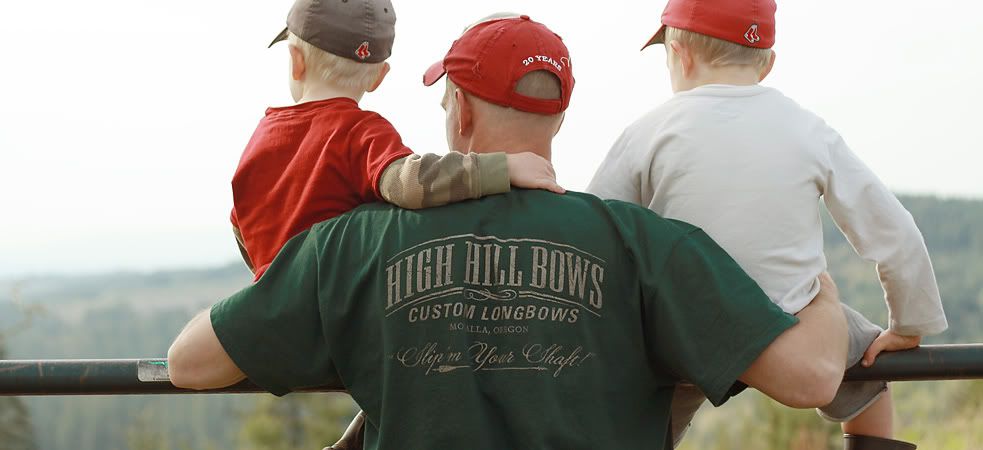
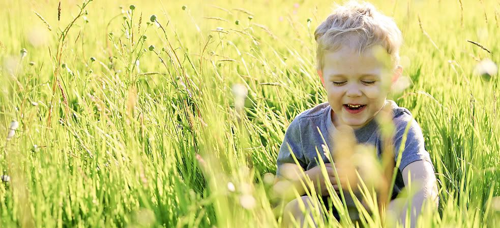


The boys are back at their monkey business in the tree (Cooper actually told me that he’s going to “swing from branch to branch looking for some tasty leaves to eat.”) and I thought it would be a good chance to work on figuring out how to eliminate the nasty green cast the leaves put on their faces last time I took pictures of them in the tree.
Enter, custom white balance. White balance is “a camera setting that adjusts for lighting in order to make white objects appear white in photos. This is more difficult than it might seem due to the fact that light cast from different sources is different in color (technically called temperature). That is to say, light is rarely truly white in nature. The light from an incandescent or halogen bulb, for example, is red/orange in color, while that from the sun is relatively blue.” Therefore, a proper white balance setting in a camera will prevent, for example, a white shirt on a child in a tree from appearing greenish. Or their skin.
I have had many AH HA moments when it comes to white balance and setting a custom one in camera, to specifically identify what the color temperature is in the exact situation has become a goal of mine. It makes a huge difference. To do this, I set my white balance to custom, held my white balance tool in the tree around where the boys were playing, took a picture of the Lastolite grey card and set the white balance off of that picture.
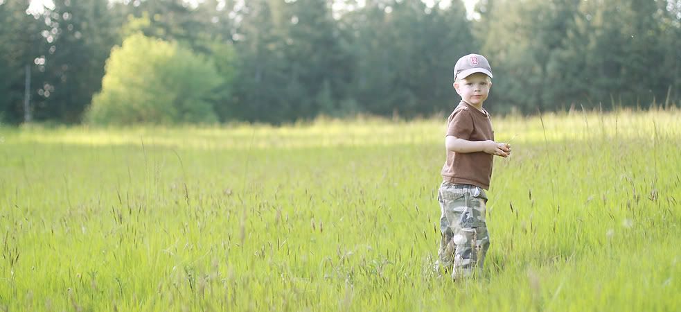
Here is an example of last time I took pictures of the boys in these trees without any editing…

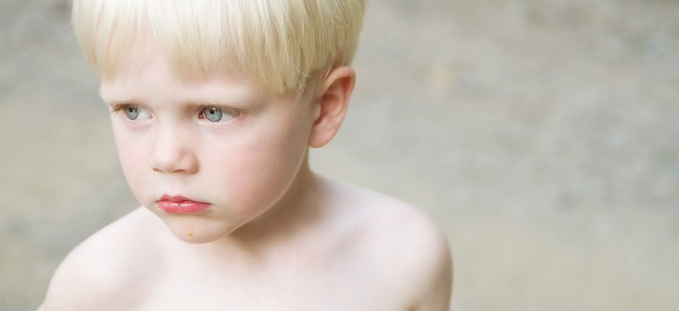
And this is an example from today, with a custom white balance… Cooper’s shirt is white and his skin doesn’t make him look like he’s Slimmer’s brother!
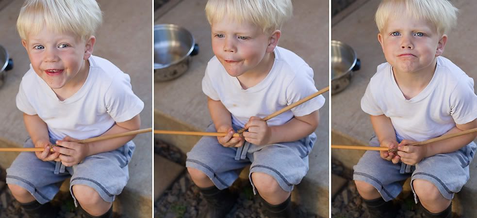
In addition to playing around with Custom White Balance, I’m also playing around with the best way to prepare my photos for the web, so below I’ve posted 3 examples of the SAME picture, resized and sharpened in difference ways to post online. I have to resize them so that they upload for me and download for you, faster. And when they are resized (smaller) they get blurry and need some sharpening. Anyhow, this is more a test for me, and a chance for you to see Cooper’s sweet face, staring off into the distance, three times.


If you can tell ANY difference at all, PLEASE share... and if they look exactly the same to you, I’d like to hear that, too, so I can stop stressing over this. :) I just have to put you through this ‘Test’ because I have to actually see the photos online to really figure out which works best. And a side by side comparison seemed to be the easiest, quickest way to go.
And here’s a quick one of Doot, who told me he’s going to sleep in this tree tonight.

So glad he doesn’t look like he’s battling with sea sickness. Custom white balance is my camera’s new best friend.
(These may not be very good photos to practice this test with, so bare with me if I have to do another…)


3 comments:
#2 looks the best to me!! I need to do the same because I feel as though my images on the web are not as sharp as I'd like them to be. Good idea!
I like #2 best also. It shows both branch and Cooper details...very sharp (and oh-so-cute).
#1 looks the best to me. #2 looks overly sharpened. Makes the skin tone look rough. #3 looks the second best.
Post a Comment